Simple Tips to Optimize Your Ecommerce Site
Ever since the first ecommerce website came online in 1982, it has been on a perpetual rise, and it hasn't stopped ever since! A massive 2.77 billion people use ecommerce websites, totaling about 6 trillion dollars in revenue.
The reason why we are sharing those numbers is to give some context into the competition involved in this domain. Ecommerce websites are highly competitive, with established players like Amazon and eBay ruling the roost.
To get an advantage against them, you need to ensure that the ecommerce website you create is highly optimized. Having mentioned that, let's get into how this can be done.
Quick Optimization Hacks for Your Online Store
1. Optimizing Page Load Speed
Most SEO analysts will start with how quickly a website loads. The simple reason is that it is one of the major ranking signals that factors heavily into page rankings. The quicker a page loads, the more chances it has of users staying on it.
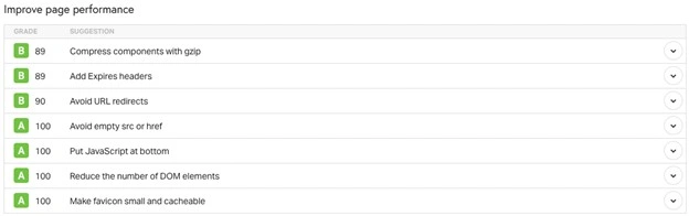
With high competition among ecommerce websites, every second matters. Ensure that all images on the page are adequately compressed and resized. Balance between compression and quality - just having a mass of pixels can be detrimental to your user experience!
Minimizing HTTP requests can be a great way to reduce loading times. Enabling browser cache ensures the website doesn't have to keep fetching data remotely from another location. Something that is often overlooked is minifying CSS, JavaScript, and HTML on websites.
It reduces file size and helps you lower bandwidth costs for the website. Last but not least, ensure you carry out regular load speed audits with Google PageSpeed Insights.
2. Choosing Mobile-First Design
With mobile devices outpacing other sources of web traffic, the time has come to opt for a mobile-first design strategy when it comes to ecommerce websites. Focus on designing the website for the smallest screen first and then resize and iterate it as needed for larger devices.
The website should be responsive and friendly to touch controls and have buttons that are reasonably large. The key to making mobile design work is not to cram the interface with all sorts of design elements. Space them out as required and reduce the number of inputs required.
A rule of thumb (pun unintended!) is to simplify navigation for users so they only need to use their thumb. Unnecessary popups can be a nightmare on mobile devices, so ensure to use only those that are absolutely needed. Testing exhaustively on real devices with different display resolutions will ensure better adaptability.
3. Using Compelling High-Quality Visuals
The one area where ecommerce websites need to focus to deliver a stellar user experience is the quality of their visuals - images and video. While brand-provided images are a good start, if it is low-resolution, shooting your own is a better idea.
Invest in professional equipment and talent to get the most out of your product shoots. It is vital that you cover as many angles as possible of the product so people can get a good idea of what the product looks like.
Choose a theme for your product photography and stick to it across all products. This is important to establish brand identity and consistency across comparative products. Adding videos for the product, especially on how to use it, can be beneficial for users.
Be sure that you optimize images and videos for the most commonly used formats. Some notable formats for images are AVIF and WebP, while videos can be compressed with AV1, H.264, and VP9.
4. Creating Persuasive Copy for Products
Now that you've got great-looking product images, it's time to match them with compelling written copies for them. It is important to remember that the person browsing a website is looking to make a quick buying decision. And they can't do that if the website is full of clutter and sales-speak!
Focus on the benefits that the product offers and not just features. The goal is to help the customer solve a problem that they have, not to keep repeating about features they might already know about.
The language should be as descriptive as possible without being too verbose. Adding testimonials and social proof from verified sources is a great idea. For the shorter copy accompanying images, highlight the product's unique selling propositions.
All product-related information should be scannable by the customer quickly - avoid the use of buzzwords. Ensure that you don't forget to optimize it for SEO, but be wary of keyword-stuffing the copy.
5. Ensuring a Simple Checkout Process
The checkout process is the final hurdle for an ecommerce company before a user becomes a customer. But there are many factors that influence this, and not all ecommerce companies get it right. One only needs to look at the high 70% of cart abandonment to understand why!
The aim of any ecommerce website is to ensure that the checkout process involves as few steps as possible.
Offering a guest checkout option is a major change that helps avoid cart abandonment. Not forcing people to create an account is a huge benefit and can result in much higher conversion rates as well.
Another way the experience can be improved is to offer a few different payment options, including cash on delivery, where possible. Ensure that your checkout process has a clear progress indicator where the user can clearly see where they are at.
6. Building Trust and Credibility with Social Media
Trust is an important commodity of all ecommerce websites, and it's worth its weight in gold - possibly more! People rely on other people to make up their minds about a certain product. Having a live social media feed on the website is a great idea to encourage people to buy.
User-generated content should be encouraged and displayed on the website. Feature customer reviews and testimonials prominently and ensure that users can click them to read more. Social proof widgets like Facebook, Instagram, and X should be integrated into the product page.
As an ecommerce business, ensure that your social media feed is regularly updated. Engaging with users and replying to their comments goes a long way to establishing credibility.

To get more reach, partner with popular influencers in your niche and also share behind-the-scenes content.
7. Implementing Site-Wide Smart Search
A key ingredient of the success of most ecommerce websites like Amazon is the inclusion of a powerful smart search feature. This type of search enables users to get information about a product they want without having to unnecessarily click through dozens of menus and links.
The key features every smart search should have been autocomplete and typo exclusion. Autocomplete is vital because it helps the user search for the things, they want without having to recall exactly what the product is.
People can make typos, so a search should be smart enough to ignore that and show them the most probable results. In case there are zero-result searches, users should be redirected effectively through effective and relevant suggestions.
To ensure people make the best use of searches, position the search right at the top, and it should be adequately highlighted. Track and analyze search data to ensure better searches in the future.
8. Designing Clear and Intuitive Navigation
Navigation is a critical part of an ecommerce ecosystem, especially if the website contains a large number of different products. Starting with proper categorization of the products is a good first step. Ensure that the categories go from large to small and in a logical way.
The categories should have a description or a tooltip that can help guide users to the right product. The labels should be clear and descriptive without room for misinterpretation. Including a sticky header that remains consistent through all pages of the website is a great idea.
Implementing a breadcrumb navigation strategy is a proven strategy when it comes to ecommerce, and it still works really well.
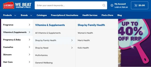
The footer of the page should have important links, including contact information and customer service. Last but not least, exhaustively A/B test page layouts before you finalize on one.
9. Creating Impactful Calls-To-Action (CTA)
CTAs with positive intent are a great way to capture audience attention! Starting CTAs with action-oriented verbs like "Click Here" or "Get Started" can increase the number of clicks. All CTAs and clickable elements should have a distinct color from the rest of the page.
Studies show that people are more likely to click on something that catches their eye. Ensure that the language is persuasive and addresses the user rather than the product. The goal is to sell the benefits of the product rather than the product itself.
The CTA or the button should feature prominently and above the fold (without users having to scroll down). Again, A/B testing here is critical to success. Don't be afraid to experiment with different sizes, shapes, and colors for your CTAs.
10. Using Effective Exit-Intent Popups
Exit-intent popups are messages that display on a website when a user navigates away from the website without buying anything. While exit-intent popups are an effective tool to keep users interested, they have to be used carefully.
To make it more enticing for users, consider offering them a good discount or a compelling incentive. It is vital that you use a benefit-driven headline that addresses the most common factors why they might be clicking away.
Ensure your exit timer has an adequate interval - you don't want to aggravate a user who has already decided to move away from your website. Making the exit popup big so that it blocks the whole page is a mistake and should never be done.
11. Implementing Strategic Cross-Sell Strategies
A huge advancement in modern ecommerce websites is the addition of the "Frequently Bought Together" and "Customers Also Viewed" suggestions. These can highlight products that the users might not have thought of before, thereby increasing the chances of a sale.
It is critical that these suggestions be based on real transactions and data. If not, users will see it as just another minor annoyance on their way to the checkout page. And you will lose the opportunity to cross-sell to them.
Limit the number of suggestions that you offer on a product so as not to overwhelm the user. These suggestions should be adequately visible and have a short description, which can help make a more effective purchase.
12. Analyzing and Iterating Based on Metrics
Data is a huge part of what makes an ecommerce website successful. Have processes in place that track key performance indicators (KPIs). Implement a dashboard where marketers can take a look at these metrics and make effective changes.
Using real-time stat tracking systems is a great way to keep ahead of the data. Conversions should be monitored constantly to understand where mistakes are being made. User behavior should be analyzed through heat maps and other visualizations to improve the customer journey.
It is vital that you track traffic sources on your website to understand where to focus your marketing spending. Keep track of vital metrics like Customer Acquisition Cost (CAC) and Average Order Value (AOV).
Key Takeaways
● Audit and improve the website's loading speed as regularly as possible to ensure higher rankings.
● Design a mobile-first website because that is where the majority of your users are.
● Implement an effective smart search tool to make searches less tedious for users.
● Focus on delivering a great user experience through impressive visuals and content.
● Build trust and credibility by highlighting user reviews and testimonials through social media.
● Create compelling CTAs and exit-intent popups that guide users to a positive action, like a purchase or adding to cart.